Smoothing out the Rough Edges - A Site Revamp
As part of the initiative of cleaning up the slightly rough edges of the site, I collated a list of pain points and dedicated an entire mini-project to smoothing these out:
- adding support for dark mode (finished and documented in another post)
- removing redundant classes in the HTML
- adding proper spacing to the header elements on mobile
- adding proper width settings for snippets on mobile
- modifying the inline code decorations in tailwind/typography (documentation pending)
- a favicon (not started as of writing)
DRY-ing out the code
To implement the dark mode as outlined in the previous post, I had to focus on a more shotgun approach with the classes that @tailwind/typography required. As a result of that, I had a lot of the classes below scattered around nested sections of the site.
<div class="prose prose-purple dark:prose-invert">
When I initially created the site, I thought I only needed to specify the class in the section of the site that contained the HTML-generated-from-markdown for the post contents. I had to add these to divs that are higher up in the hierarchy so that the text within these elements will also swap colors when toggling between dark and light modes.
<body class="font-sans bg-zinc-100 dark:bg-zinc-800 prose prose-zinc prose-purple dark:prose-invert max-w-none">
After referencing other examples of the implementation, I realized I could just specify this in the body element and remove the max width as indicated in the repo on github.com.
Each size modifier comes with a baked in
max-widthdesigned to keep the content as readable as possible. This isn’t always what you want though, and sometimes you’ll want the content to just fill the width of its container.
So instead of specifying the prose elements in the header, content, and footer divs within the body, I only need to monitor and look at the classes in body. This was also observed in other parts of the page but this is the most egregious example - three repetitions in succession.
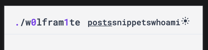
Spacing out the Header Elements
Ever since the addition of snippets in the header, I’ve been dealing with this atrocious spacing issue when viewing the site on mobile devices.
I had to tackle this problem from several angles:
-
text-lgwas set for the logo even for smaller screens, this was remediated by settingmd:text-lgso that the logo only scales up on bigger screens.<div class="... md:text-lg"> -
No padding was specified for each
div, resulting in all of them touching each other. This wasn’t as apparent in larger viewports due to the abundant space within eachdiv. Addingpx-1to alldivfixes this.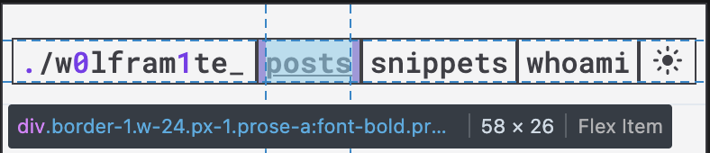
-
While we’re here, I previously specified
font-style,font-size, andtext-alignin every div in the header. Consolidated all of the classes to the parent div, to reduce repetitions.<div class="..."> ... <div class="w-24 font-mono text-base text-center"> <div class="w-24 font-mono text-base text-center"> <div class="w-24 font-mono text-base text-center"> <div class="w-6 font-mono text-base text-center"><div class="...font-mono text-base text-center"> ... <div class="w-24 px-1"> <div class="w-24 px-1"> <div class="w-24 px-1"> <div class="w-6 px-1"> -
Further simplifying, I used to add an empty
divwith thegrowclass thinking this would be the div that expands and shrinks between the more fixed ones -... <div class="grow"></div> ...but this can be accomplished by specifying a size, min-size, and adding the
growclass which reduces the number of elements that I need to keep track of.<div class="grow w-48 min-w-34 px-1 md:text-lg text-left">
Fixing Broken Content Widths
I noticed that the content in snippets doesn’t shrink to the viewport on mobile. Either this was something that was already there and unnoticed due to not having a long enough snippet or something introduced in the restructuring. Either way, it was something that needed attending to.
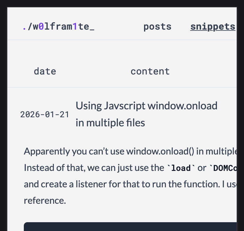
As mentioned before, the typography module pre-configures the width of the element. This default behavior likely intends to create “readable text widths” but this isn’t as applicable on mobile where you’d want it to fill out all of the available space.
-  <article class="md:max-w-2xl px-1">
+  <article class="w-full md:max-w-2xl px-1">
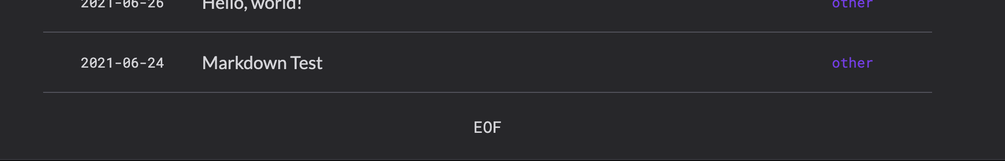
Figuring out Borders
There was this long-standing issue when generating the list of posts and snippets wherein the last element would have double borders - one from the last item in the list and another on the EOF footer at the end of the page.
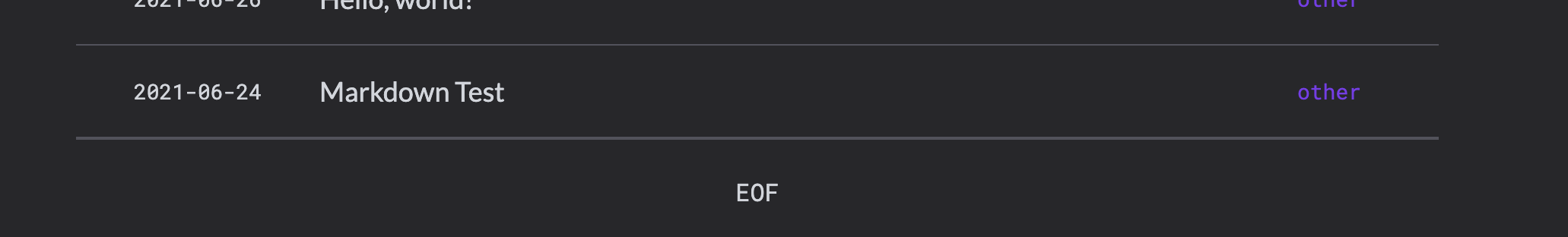
With the following implementation:
<div class="border-b">1</div>
<div class="border-b">2</div>
...
<div class="border-t ...">EOF</div>
While browsing through the documentation I found the divide- utility. It automatically sets the border for all div within the div except for the last one. The HTML would look something like this:
<div class="divide-solid divide-y-1 divide-slate-200 dark:divide-zinc-600">
	<div>1</div>
	<div>2</div>
</div>
I was curious how this was done via the CSS and I wholly did not expect the can of worms that I would uncover about the complexity of CSS. Today I learned that CSS has functions.
  .divide-solid {
    :where(& > :not(:last-child)) {
      --tw-border-style: solid;
      border-style: solid;
    }
  }
This was a good discovery as it would lead me to discover more information about how tailwind uses CSS (and how I would learn how to modify the inline code block decorations).
Conclusion
Overall, I am more or less satisfied with the current state of the website with the above fixes applied. In the future I could look into modifying some elements within the @tailwind/typography which would give me a reason to do a deeper-dive of CSS.